
PROJECT DETAILS
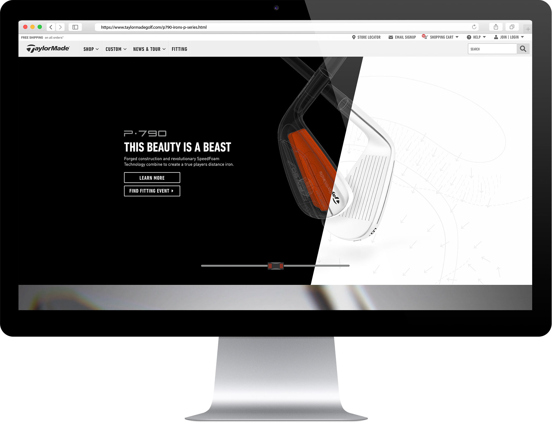
The introduction of the P700 Series Irons made a huge splash in the golf industry in 2017. My task was to design a landing page that would adapt to the user’s path of discovery. The page would normally default to a version with an interactive scrubber at the top, showcasing the P790 with its SpeedFoam interior. The secondary structure would bring the club carousel to the top so that users could see the entire product lineup in one go. They could then click into a product tab to learn about the features and benefits of each product.
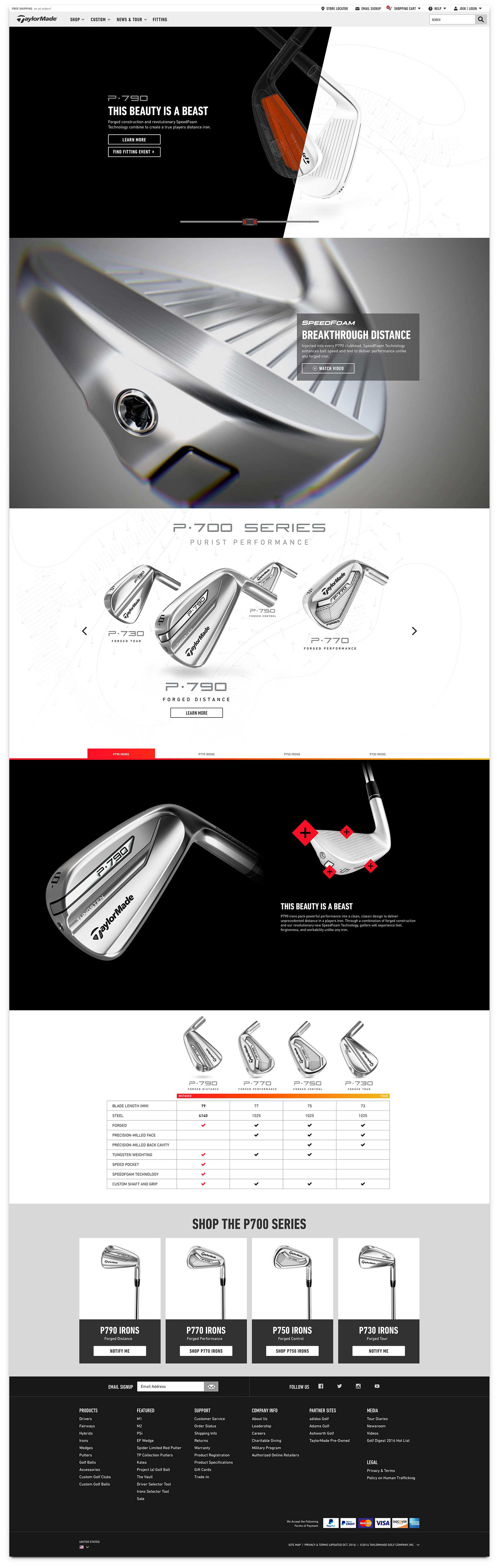
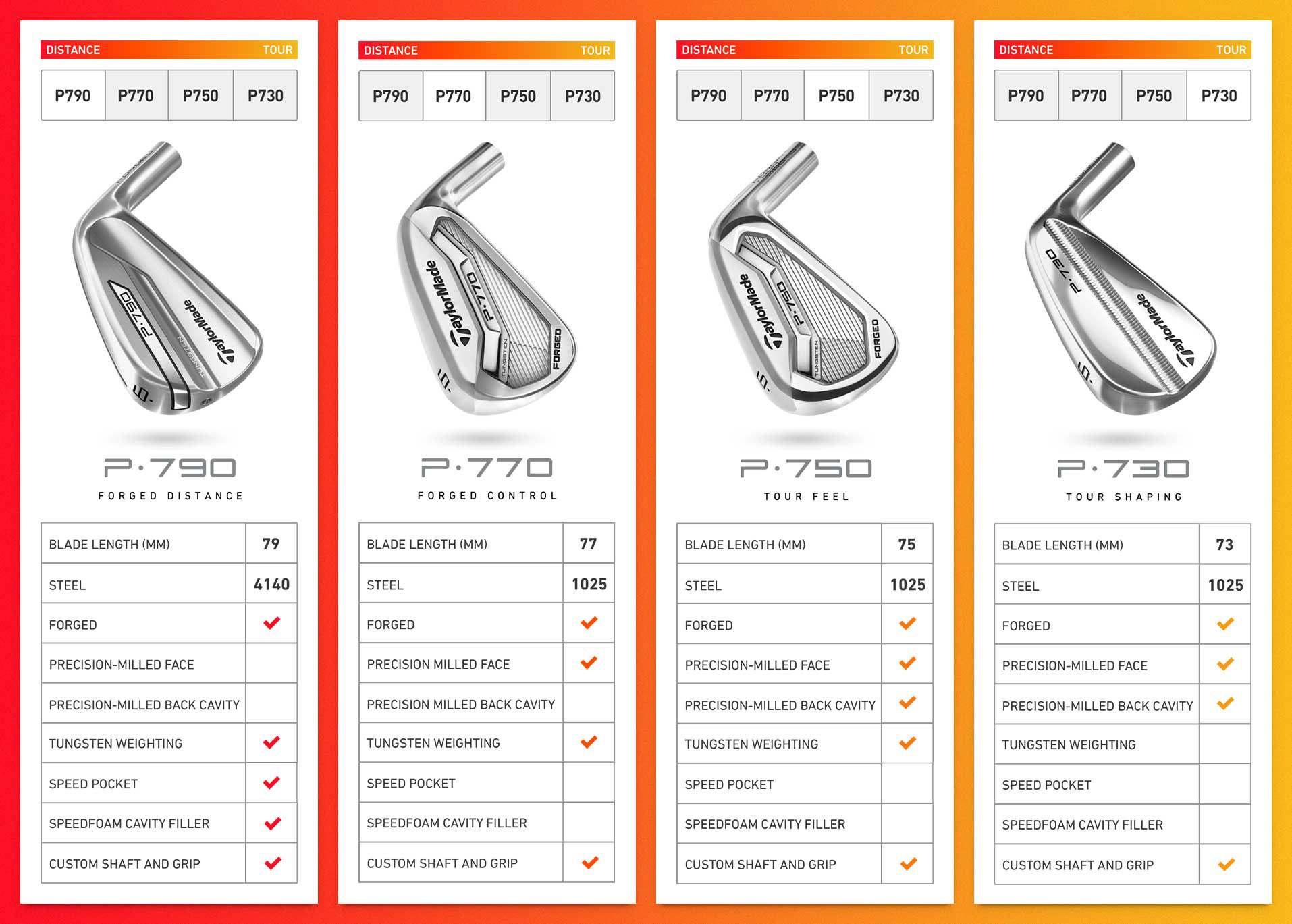
One of my favorite parts of the page is the responsive grid comparison, in which the user can perform a side by side comparison of each iron in the family. This comparison grid also had to work well with limited space on mobile, so I designed a tab system allowing the user to easily navigate across the grid to compare iron specs. A color gradient was also used to help the user understand where the clubs fell on the Distance to Tour spectrum. A subtle hover animation and checkmark highlight were introduced for a hint of delight.
ROLE
UX/UI Design, Interaction Design
P700 Series Landing Page (Desktop)
P700 LANDING PAGE
The video above demonstrates how a user might experience the page. You can also check out the live page here.
P700 Series Grid Comparison (Mobile)
RESPONSIVE GRID COMPARISON
Mobile and tablet users are able to easily tab through the product comparison grid. User recordings have shown this to be a good solution to the problem of comparing multiple items with limited space.